ShopDreamUp AI ArtDreamUp

Deviation Actions


Suggested Deviants


Suggested Collections


You Might Like…


Featured in Groups


Description
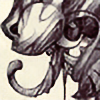
EDIT: (1-27-2013) File has been given increased contrast along with digital paintovers in various areas to fix flaws in the original painting.
A (stupid) portfolio type project I gave myself over the holidays. Here we have a kelpie returning to the depths of its icy lake with unwitting prey. This is why you don't jump on the backs of strange horses, kids! Things aren't always as they seem.
I didn't intend for the image to turn out this way, but rather made it up as I went along. I have been struggling between a more realistic approach and stylization... I'd like to push the contrast more, since all I get is a kind of awkward final image.
This was drawn/painted using Derwent's Graphitint pencils, which are lightly tinted watersoluble graphite pencils. Final details were added with watercolor and white acrylic. So... a "sort of" experiment, if you will. Someday I'll get better (THIS YEAR?)
I'll be getting back to posting commissioned work soon, since I have new nibs/renewed energy/scanner/etc.
Approximately 4.75" x 10", graphtint pencils, watercolor, acrylic on Stonehenge paper. Comments and critique encouraged.
Image size
468x946px 441.52 KB
© 2013 - 2024 pallanoph
Comments36
Join the community to add your comment. Already a deviant? Log In
Not really the kind of piece I expected from you, but I love it never the less. The eerie vibe it gives is magnificent, and I love the kelpie's head. So intimidating. <3