ShopDreamUp AI ArtDreamUp

Deviation Actions


Suggested Deviants


Suggested Collections


Description
So this is the beast that is priority at the moment: A Bretonnian knight battling a sea serpent, as commissioned by ~Riitual. I had posted the color sketch months ago!  I know this may sound silly to some of you, but more "epically sized" commissions are far more daunting than petty personal work, so it takes me time to work up the courage to boldly start and not make a million mistakes. Watercolor can be particularly unforgiving, and in this situation, it's been wise of me to work slowly (and patiently).
All that aside, I am thoroughly enjoying the painting thus far. I despise drawing and planning backgrounds, but enjoy painting them. Despite this, I must soon move on to the main subjects!
So! Critiques! I am looking for them. I think the sky needs to be lightened with the help of acrylic, and the water darkened accordingly. What do you think? All thoughts welcome!
Specs so far: Winsor and Newton artists watercolors on Arches 140 lb hot press with a few touches of gouache for the wave spray. 14 x 20" (35.56 x 50.8 cm)
Art © April Schumacher. Bretonnian knights are from Warhammer (Games Workshop).
I know this may sound silly to some of you, but more "epically sized" commissions are far more daunting than petty personal work, so it takes me time to work up the courage to boldly start and not make a million mistakes. Watercolor can be particularly unforgiving, and in this situation, it's been wise of me to work slowly (and patiently). All that aside, I am thoroughly enjoying the painting thus far. I despise drawing and planning backgrounds, but enjoy painting them. Despite this, I must soon move on to the main subjects!
So! Critiques! I am looking for them. I think the sky needs to be lightened with the help of acrylic, and the water darkened accordingly. What do you think? All thoughts welcome!
Specs so far: Winsor and Newton artists watercolors on Arches 140 lb hot press with a few touches of gouache for the wave spray. 14 x 20" (35.56 x 50.8 cm)
Art © April Schumacher. Bretonnian knights are from Warhammer (Games Workshop).
Image size
1190x850px 835.66 KB
© 2013 - 2024 pallanoph
Comments60
Join the community to add your comment. Already a deviant? Log In
Hello there!
It's the first critique I'm doing this way, so I'll hope I get everything right so far.
The water is very well drawn, I really admire it! I wouldn't necessairily darken it. The splashs and the waves give the picture quite a great dynamic by now.
About the sky: Tip of the hat for the clouds, their shadowing is made quite nicely. What I miss is the following: To me the sky is a bit too blue. I think normally a cloudy sky has more grey and a hint (reeeeaaallly only a very small one) of purple/lilac in it.
The effect of having the sun shining halo-like above our knight gives quite a nice effect of heroism to him. And with the sun in his back it might help our hero against slaying that serpent monster! Go for it! <img src="e.deviantart.net/emoticons/s/s…" width="15" height="15" alt="
The cliff: Purple-Demon mentioned that a part of it looks unfortunately a bit flat. To me that's only the upper right part of the cliff. The other, smaller part between dragon and knight is allright. Because you used a more distinct shadowing there, at least that's the one big difference that occured to me. Maybe using that on the other cliff-part would help?
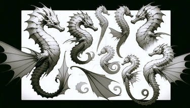
Oh, the idea of having the knight fighting a sea serpent is a nice variation since having a knight and normal (terrestrial) dragon fighting against each other is a nearly chronical appearance.
About the angles: The main diagonal angle created by the serpent is quite nice and makes the picture more three-dimensional. The portrayal on the hero is well-made, considering that the water-covered part of the serpent is allowing us a better focus on him. Such a break in the main angle makes people curios about finding the reason for it (here: focus on the knight), at least that's what I think. <img src="e.deviantart.net/emoticons/s/s…" width="15" height="15" alt="
All in all, well done! <img src="e.deviantart.net/emoticons/t/t…" width="15" height="15" alt="